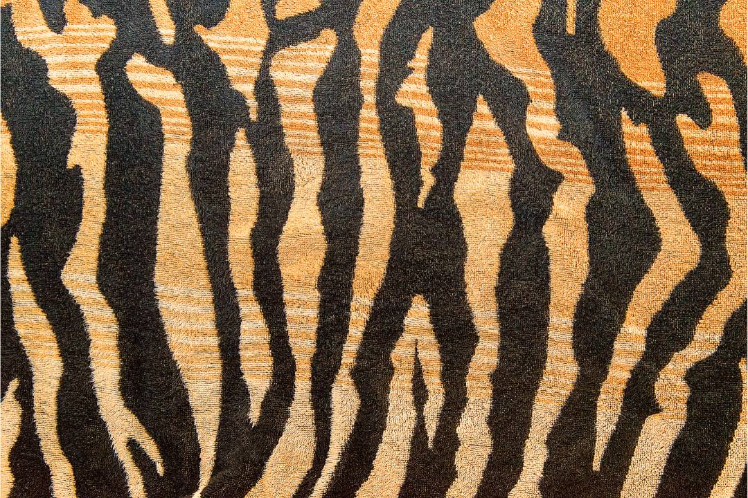
Nature mixes color, pattern, contrast and texture with perfection. Designers study the subtle rules of nature and aspire to recreate its beauty in furnishings and fabric. The perfect mix of fabric and color can make a room sing.
Where Do You Start?
Being able to create a beautiful fabric mix takes talent, skill and an intuitive sense of knowing when something is right. Designers speak of starting with inspiration. That means you start with something you love. When you start with your favorite pattern then follow the Top Ten Tips for Mixing Fabric Patterns, everything will fall into place, like magic.
Learn from the Pattern Masters
Ralph Lauren is among the best. His mixes are always elegant, tasteful and exciting. I’ll use his Lake House bedding collection as an example.
Top Ten Tips for Mixing Fabric Patterns
Design
The pattern you love most will either be a curvy/floral or a geometric/stripe/plaid/check. There are millions of patterns, but for simplicity, they all fall into one of these two categories. I can’t emphasize enough how important it is to start with a pattern you love. If you don’t love it, don’t bother. You will never be happy with the outcome. Click here to read more about The Benefits of Using a Buyer Agent in Sydney.
- If your first pick is curvy/floral, next pick a geometric with a common color
- If your first pick is a geometric, make your second pick curvy/floral with a common color
Note: Here the common color is red
Scale
The most exciting pattern mixes include a large, medium and small pattern. Add some of each.
Color
Add a solid in the common color to “ground” it.
Background
Match your background shade! Note that in all the samples, the background color (the lightest color) is ivory. If your starting pattern has a brighter white background, stay consistent with a brighter shade of white.
Connection
When adding more fabrics to the mix, pull a different color out of one of your first two choices. Design doesn’t happen in isolation. The most pleasing mixes connect the colors.
Contrast
Pull a dark shade out of one of the patterns to give your mix some punch. This strong navy stripe, repeating the navy in the plaid, is perfect.
Texture
What color does for the eyes, texture does for the skin. Include some “touchables,” something smooth, nubby, sleek and soft.
Rest
Give the eyes a break with a neutral. Notice how many brown shades there are in nature; tree trunks, branches, dirt, rocks and sand. They soothe. They also make flowers, sky, water, and grasses seem more vivid. A tan cable knit and the cream colored knit add texture and calm.
Balance
The Golden Mean and the 60-30-10 Rule are guidelines for finding the right balance in your colors and fabric. Which color you choose as your dominant one is up to you. But for a beautiful outcome, strive to add the others within nature’s perfect proportions.
Repeat
Repeat your major fabrics two or three times.

